ADVERT COMPARISON
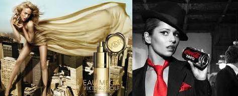
VICTOR + ROLF Advert:
The facial expression of the models face is not a key focus of the advert, but I think the facial expression of the models face is posed and of seduction. She is using a direct mode of address,the connotations of this is to tell the viewer that they too can be like her and can be as powerful as her, if they buy the perfume.
This person has been chosen because her hair is golden brown and matches the whole theme of the colour gold. Also, her appearance is thin and looks good in the dress. The female stereotype that is being used in this picture is, the one where females are sexy, slim and are fashionista’s. The ideologies that we associate with this model are that she is not only representing a brand but also physical attributes as well as the the ideologies of a typical model.
The models pose is specified to make her look like she is empored and on top of the world. She is holding the product in a greedy and sefish manner but her head is still positioned so that you can still her face. The fact that she is presented as really tall is accentuated to inform the public that she has the most power and importance in the image, this is accentuated because it is the biggest selling point of the image as it makes the veiwer believe that buying the product will empower them and make feel important.
I think the model is dressed that way because it matches with the rest of the adverts theme of gold. Also, her dress is short so her legs are more noticable which makes her look taller. This advert tells us that she is known as a fasionable woman and she uses her body to her advantage. As well as that, people feel like if they buy the product they will become more attractive to the opposite sex like the model in the image.
The setting of the advert is a display of the city. This is because the advert is supposed to be displaying her as a leader and a powerful icon. This setting helps prove that idea as she is taller than the city which makes her higher than anybody else in the advert.
The advert uses a high key lighting, the feeling created through this is admiraton and royalty as the spotlight is on her. The colour that stands out in the advert is gold as most of the props and features are made up of gold.
The product takes up almost a third of the page to emphasise the product in order to fufill its purpose to sell the product. The products particular shape is tall and straight to show the shape of the model and represent the theme that the model represents.
I think that the target audience for this advert is mainly middle class women, social classes A and B, whose lifestyle category would probally be trendies. The advert appeals to this audience because it uses the esteem category of marslows hierarchy of needs, it uses the fact that them type of women like to feel confident and sexy.
COKE ZERO Advert:
The expression on the models face is as if she was interupted in the middle of a crime. She is using an indirect mode of address, the connontations of this is to give the advert a more mysterious and edgy look.
This model has been chosen because she is a celebrity and supposed to be britains seetheart, this advert totally contradicts that status. The ‘beauty bunny’ female stereotype is being used ion this acdvert because cheryl cole, the model, is known for being beautiful. The ideologies that we associate with her and the is that they are both beautiful whether in taste of appearance.
Cheryl’s head is positioned so that the right amount of light hits her face to give her that mysterious look and also the look of being captured. The way she is holding the product is like she has been caught stealing something precious. I think that her face and the product is accentuated as she is known for her beauty and her face is where the story is told, it tells us that she has been caught and that she has been doing something wrong because of the look of precaution and guilt on her face. Also, the product because the main focus of the advert is to sell the product.
Cheryl is colour scheme matches the products colour scheme, they are the only two things in the product with a hint of colour.I think that cheryl is dressed in a suite with a slanted hat is because she is trying to get away with being a man. This is because in previous adverts the drink has been targeted at males and has been said to be a ‘mans drink’. However this advert condtradicts that focus and shows that women drink it also whether that may be by dressing up as a man, i do not know? I think the advert is focused on that story and not much of the model except her face, as she is a role model to many people.
The setting of this image is a dark room, it looks like she is a party. The set theme looks like its set back in the 1920s. Everything looks black and white except for cheryl and the product. I think that the connontations of this is that back then males where the dominating gender and this brings back the theme that the drink is for men and women are not meant to drink it.
The advert uses a low key lighting scheme, this creates a feeling of curiosity, puzzeled and awe. The colour that stand out is red because, black and red is the theme for the product, so making red the only vibrant colour stand out, is making the product stand out.
The product is not that big on the page, but thats because the product itself is not very big. The product has a cylinder shape, that is because it is a drink and its in a can.
The target audience for this product is (refering to social class, gender and lifestyle category) any social class, as it is a drink, women as they are trying to widen their target audience and rebels because they are going against the stereotype previously created for advert. This appeals to the audience by using maslows section of esteem which increases your self-esteem, condfidence, acheivement, respect of others and by others.
COMPARISON QUESTIONS
1) The main differences in how the model is represented in these adverts are that one is supposed to be iconic, sexy and a role model, whereas the other advert represents mischieve, seceracy and a rebel.
2) The target audience is similar is some ways, as they are targeted towards women however they are targeted to different lifestyle categories and one advert is targeted at all social classes.
3) They haved used different persuasive techniques because they are targeted at different types of people. The persuasive techniques used in the victor and rolf advert are sex sells and beautiful people, these are very effective forms of persuasion, because if people think that a product will make them more attractive, they will buy it. For the Coke Zero advert, the persuasive technique used is beautiful people, this is basically using good looking models to try and tell us that if we use the product, we will look like them. Also, in the advert they contradict the stereotype they have earlier created for the product, which is that it is for men. However this advert is showing a women disguised as a man, taking the drink, this is to widen their target audience. For example the first advert uses the fact that the model is a role model for her flawless looks, whereas the other advert uses the fact that the model is represented as an icon to women as she is going against the rules, she is rebelling. Those are the two persuasive techniques I have gathered form the advert.
Wow: Nishat, this is excellent! Really, well done. You write in so much detail and clearly understand the theories and concepts we have studied, applying them to your two chosen adverts with confidence.
ReplyDeleteNow: You need to check your work for spelling and grammatical errors. Cheryl Cole's name does not alwys have capitals. The first line of the third paragraph you have spelt empowered incorrectly. Please check the rest of the doc for further mistakes. Improve the analysis of the Coke advert.
How: Why do only Cheryl and the Coke can have colour? What persuasive techniques does this advert use? In the comparison questions, take out the numbers and consider your answers more, you repeart yourself a bit and contradict yourself too.
Mock grade: Your mock grade is an A! Well done! :)